Overview
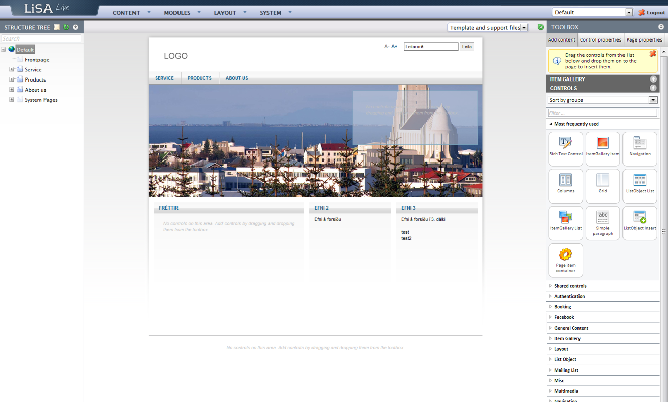
The LiSA Content Management System window is divided into three main sections.
- Left: On the far left you see the Web tree used for page management.
- Middle: In the middle is the area where actual content creation/modification takes place.
- Right: On the right is the area for managing web parts and controls.
- Both the left and right area can be minimized by pressing these symbols
 and by that creating a more simple working area for content creation.

Web tree

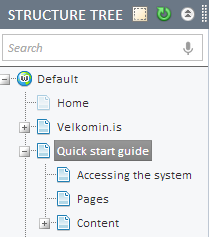
The basic Web Tree view is shown in the graphic on the left: This view shows all the pages and sub pages of the Website.
- If you click on the plus symbols in front of the pages you will see all the sub-pages for that category.
- To hide them again you can click on the minus symbol that appears in place of the plus symbol once clicked.
- You are able to see both visible and invisible pages in this view.
- The invisible pages, as will be explained later, are shown in a lighter color than the visible pages (see image right).
Note: Pages who have an edit/pencil icon in front of them in the Web Tree have not been published yet (see image below).
Web tree settings

Three action icons appear above the Web tree:

Showing/hiding page components. By clicking this icon, page components on every page are visible in the Web Tree if the icon is clicked on again the tree can be seen in default mode again. This can be useful to get an overview on how pages are composed and built.

The green arrow icon is used to refresh the Web tree in cases where for example caching is showing an older version of the tree.

The icon with the two upward facing arrows can be used to minimize the Web Tree. By clicking the arrow icon again the Tree can be maximized.
