Content
Controls
The controls are used to add and manage the content on a page. There are several controls available that all have different features and purposes. In this guide the most common controls will be explained in detail.
It is easy to use the controls. Simply find them in the toolbox list and drag them to the page. To adjust the control settings, choose the control by clicking on it on the page. The specific settings for the control will then be displayed under the list of available controls. It is important to press “Apply” to save the settings before publishing the page. Several of the controls have a “Layout” property. This is used to choose previously defined layout template for the control.
To remove a control you simply drag it back to the toolbox. Drop it when you see the picture of a recycle bin appear instead of the list of controls.
Control units
Drag and drop the control you want to use to the page preview witch is located in the middle.
Here is a short list of available controls.
-

Rich Text Control:
This is the main control for content editing. The HTML content makes it possible to add static text and images to the page. The editors used in the control will be explained in more detail in a chapter below.
-

Columns:
The columns control can be very useful when you want more than one column of text or other content on the page. When the control has been added to the page you can choose the number of columns in the properties area. It is then possible to add other controls to each of the columns. The picture below shows the columns control with 3 columns before the user has added any content to each of the columns.
-

Item gallery item:
This control is used to display a single item from the gallery. Simply drag the control to the page and choose which item to display in the settings. It is possible to choose a previously designed layout for the item.
-

Item gallery list:
With this control you can display a list of items from the item gallery. After adding the control to the page, choose which category of items should be displayed and choose a previously defined layout for the list. In the properties area it is also possible to choose if items in the subcategories should be displayed, to set the order of the items and to choose a layout for the list.
-

Listobject item:
This control is used to display a single item or record from a list. In the properties area the item is chosen and also a previously designed layout. This control is usually used for displaying items chosen from a list in more details.
-

Listobject list
The listobject list control is used to display all or a certain number of items from a list. In the properties area you can manage settings such as the amount of items to display, what list to display, the layout for the list and how the items should be ordered.
-

News item:
This is the control used to display a single news article. When the control has been added to the page the news item can to display can be chosen in the properties area. It is also possible to manage settings such as date format and the layout for the article. This control is often used to display articles from a news list in more detail.
-

News list:
This control is used to display a list of news based on various filtering settings. It is possible to choose what categories of news should be displayed, how the layout should be, the ordering of the news list and several other more advanced settings.
Editor
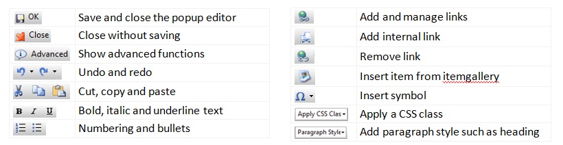
There are two ways of editing when the Html content control is used. One way is editing direct in the control on the page. The second choice, which gives you more advanced editing options, is the popup editor which will appear if you press “Edit” in the top right corner of the control. Below is a picture of the menu in the popup editor.

The popup editor has several functions and formatting options. The most common functions are shown in the basic view, but if the button “Advanced” is pressed you will see more detailed and advanced functions such as tables and indenting. Following are the functions that are most important to know:
Item gallery
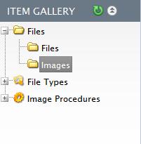 The “Item gallery” can be found under “Content” in the navigation bar. Here you can manage images, files and other media. It is possible to upload images, files, videos and other documents you want to publish. The items are divided into two folders:
- Files: Here all documents and files that are not images are stored e.g. videos, pdf files, word- and excel documents.
- Images: In this folder all images are stored. File types that are allowed are: .gif, .jpeg, .jpg, .png and .bmp.
It is possible to create as many categories of files as you want. This is done by right clicking the parent folder and choosing “New folder”. It is also possible to edit, rename and delete the folders.
The files can be viewed by choosing corresponding folder. The files are displayed in a list to the left of the folder tree. By clicking on a file or image in the list it is possible to view more detailed information about it to the right. There are several functions available for the list of files/images. These functions are displayed in a toolbar above the list:
Adding news
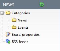
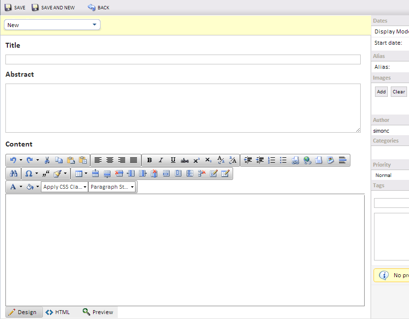
The “News” section can be found under “Content” in the navigation bar. This is where you can add news and manage old news. The news are sorted into different categories created by the user. By using the news controls on the pages it is possible to choose which categories should be displayed. To add a category, right click the “Categories” folder or the parent category and choose “new category”. It is possible to right click the categories and edit or delete them. The news articles in the chosen category are displayed in a list to the right of the. To add an article press “New” in the top menu-bar. In the new article page there are several options and fields to fill in witch you can see here below.
- Title: The title of the article.
- Abstract: A short text that describes the article.
- Content: The article is written in an editor as is described in detail above.
- Dates: The start date and End date of the article. The display mode makes it possible to choose when the article should be visible.
- Alias: It is possible to choose an alias for the article.
- Images: Here images can be chosen from the image gallery
- Author: The author of the article.
- Categories: Here it is possible to manage what categories the article should be in.
- Priority: It is possible to choose the priority of the article.
- Tags: It is possible to add tags to the article so that it can be sorted with related articles.
The lists can be found under “Modules” and then “List Object” in the navigation bar. The List object displays a certain number of instances from a list in a similar way that the Newslist control shows a certain number of news items in a list format. The instances in the list can be in various forms, types and sizes, from a number to an image or file. The list object can be used in a similar way as a database, storage for data, and the ways you can show the data and how the data is collected online can be custom made with an XSLT file.
When designing a new list object right click on the folder list Object and choose “New list” or “New folder”. Once the list has been created right click on the list itself and choose from the menu:
Managing lists
- Open list: Opens an existing list
- New list: Makes a new list which can afterwards be designed
- Rename list: Gives an existing List a new name
- Delete list: Deletes the list permanently
- Website sharing: Share the List over to other websites
- Import: Import documents to a List for example from an excel sheet
- Export: Export the content of an existing List to for example excel
- Copy list: Copy the list for use elsewhere
- View XML Data: The list in an XML form
- View XML Schema: View the setup of the lists XML
- Search Setup: Search Setup for the list
- Design list: Create a new list and define fields
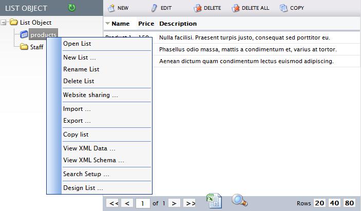
When a list is displayed there are a few functions available that can be seen in the function bar above the list. These functions are:
- New: Opens a popup to add a new item.
- Edit: Opens the chosen item to edit it.
- Delete: Deletes the chosen item.
- Delete all: Deletes all items in the list.
- Copy: Copies the chosen item.